

The Infamous Text Rule
While Facebook’s text rule regarding ads has changed and perhaps gotten a bit more gray, it also has opened up different ways to be creative with the overall design of your ad and to ensure that it’s being shown to your targeted audiences. Facebook describes the policy: “Previously, if 20% of an ad image’s area was text, it wouldn’t be approved to run on Facebook, Instagram or the Audience Network. While minimal text is still preferred, we’ve adopted a new system that allows you to run ads that would’ve been rejected under our old policy.”
The new system doesn’t totally reject ads, but the more text an ad has, the less engagement it will receive because Facebook won’t show it as often. Some digital marketers see this text rule as a major hurdle, but our team chooses to view it as a unique opportunity to better highlight our ability to problem solve and provide creative solutions.
Creative Approach
Let’s admit it, these days our attention span is teeny tiny. When scrolling through my feed it’s the image that catches my eye, not all of the text that you may think is necessary. The challenge is not how to fit tons of text on an ad; but rather, how to provide your audience with an eye-catching photo, or graphic that stops them in their tracks… and then leads them to read the caption and follow the call to action.
When designing social media ads, a few key things to keep in mind:
- The image isn’t text heavy; keep it short ‘n sweet.
- Use captivating imagery.
- Bright, high contrasting colors grab viewers’ attention.
Use the copy that you absolutely have to on the ad, and then put your creative mind to work on how to continue to get your message across through visuals. Think outside of the box with how the text is designed: the size, shape, and colors used can really be used to your advantage and further get your message across.
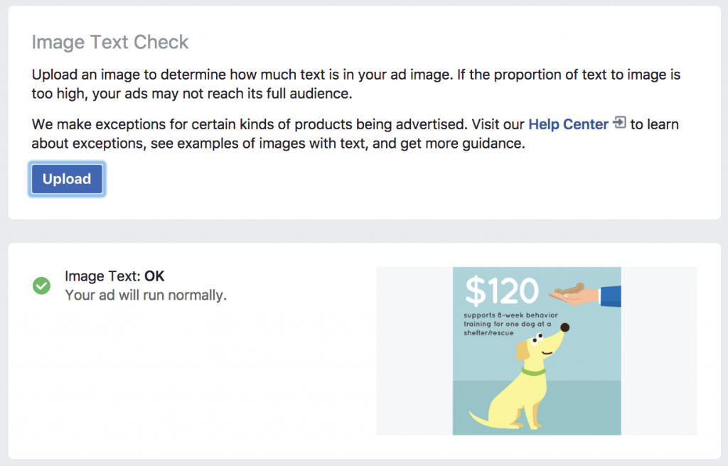
Example
For one of our clients, I was tasked with designing a Facebook ad to inform our audience of the finances required to turn a shelter dog into an adoptable dog. In the example shown below, I had to include copy that informed viewers that “$120 supports 8-week behavior training for one dog at a shelter/rescue.” By strategically placing all of the text together in the corner, and balancing the ad with bright, large, eye-catching graphics, this ad was able to run successfully reaching our target audiences.

Don’t forget to check yourself
Facebook definitely goes out of their way to make abiding by their text rule as easy as possible, so marketers aren’t surprised if their ads don’t get shown. There’s literally no reason not to double check that your ad will run as you anticipate. By using the tool Facebook provides, you can easily upload your ad and the tool will tell you if your ad will run via this scale:
- OK (preferred image style)
- Low (reach may be slightly lower)
- Medium (reach may be much lower)
- High (ad may not run).
Want to learn more about Facebook ads and other ways to market your company through social media?