

A style guide is responsible for the success of the most recognizable brands. How do they do that? By creating and enforcing a well written and thorough style guide, and of course, some really great marketing tactics.

What is a style guide?
A style guide can be as simple or as complex as a one page pdf or a 20 page manual. It is used by you, your organization, your ad agency, and in some cases even the public. Basically anyone that will be using your branding on products, publications, documents, etc. It is a set of standards that includes and enforces the style you set for your brand.
In every style guide there should be at the very least: a logo, type face, and brand colors. In some cases this is all you need, but the brands that do it right, include a lot more than that.
Logo
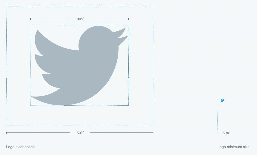
The brand logo should be included with color, size and spacing properties. Logos should have room to breathe, be sure to include the empty space around the logo. This will ensure that the logo is displayed in the most clear and professional way.
In the image below, Twitter also included the minimum size the logo should be displayed. Anything below this size is unacceptable because their logo will begin to look unrecognizable.
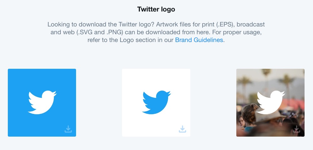
Twitter does a great job in their brand guidelines. Not only do they have a web page specifically dedicated to their brand style guide, they offer downloadable files of their logo for anyone to use to maintain consistency in public use.
Typography
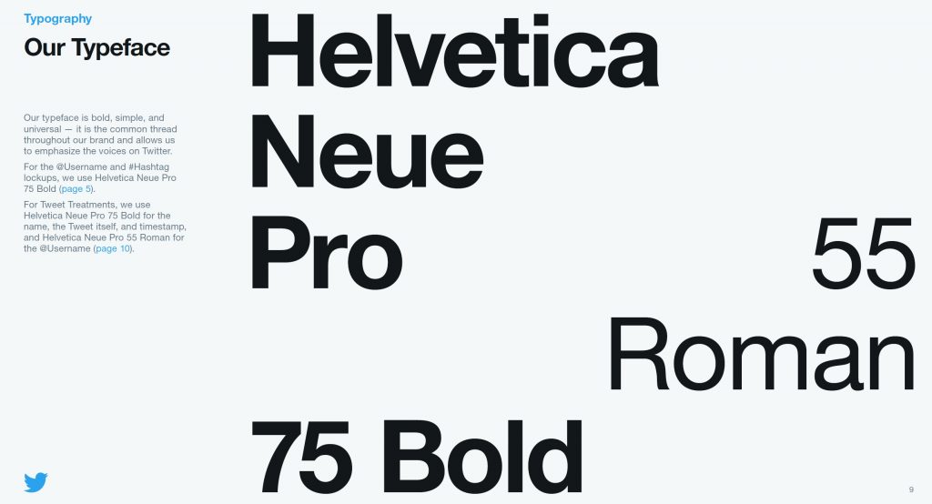
Included in a style guide are also the font sizes and weights that are displayed in publications and also on the web. Inside Twitter’s style guide they display the type face they use, helvetica Neue Pro and Roman, along with when to use it and how.
Colors
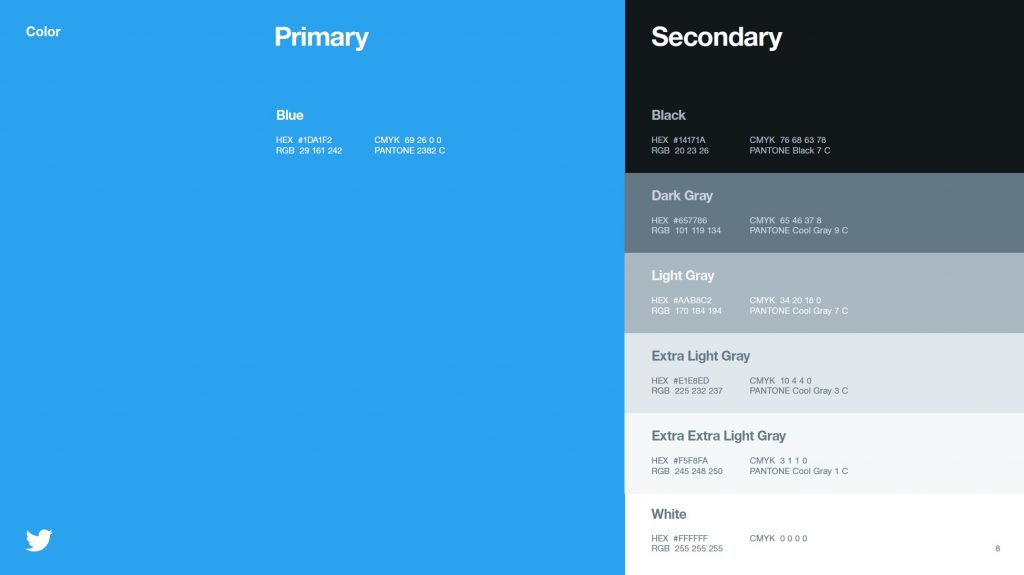
Inside Twitter’s style guide are the colors that are acceptable to use. Not only do they display the colors, they give the HEX (web code) number, the RGB, CMYK, and Pantone (branded ink) properties. This is especially important for maintaining consistent branding.
Consistency is Key
The most important thing is to maintain consistency on everything that is produced. Keeping a consistent style is what creates a recognizable brand. From the product to business cards, letterhead, marketing material, the website, and even the less obvious, invoices, and other documents.
Let’s not forget your brand voice and story. Social media accounts should all reflect a brand’s style with the same consistency. When you can maintain consistency, your brand will become more and more recognizable.
Canva compiled this fabulous list of 50 Style Guides Every Startup Should See Before Launching, there’s no point in re-inventing the wheel, so I’ll leave you with this for your viewing pleasure.
When you decide you want to nail down the perfect style guide, let us know, we can help.