You can still keep all your content and redesign a web page for an improved user experience on mobile.
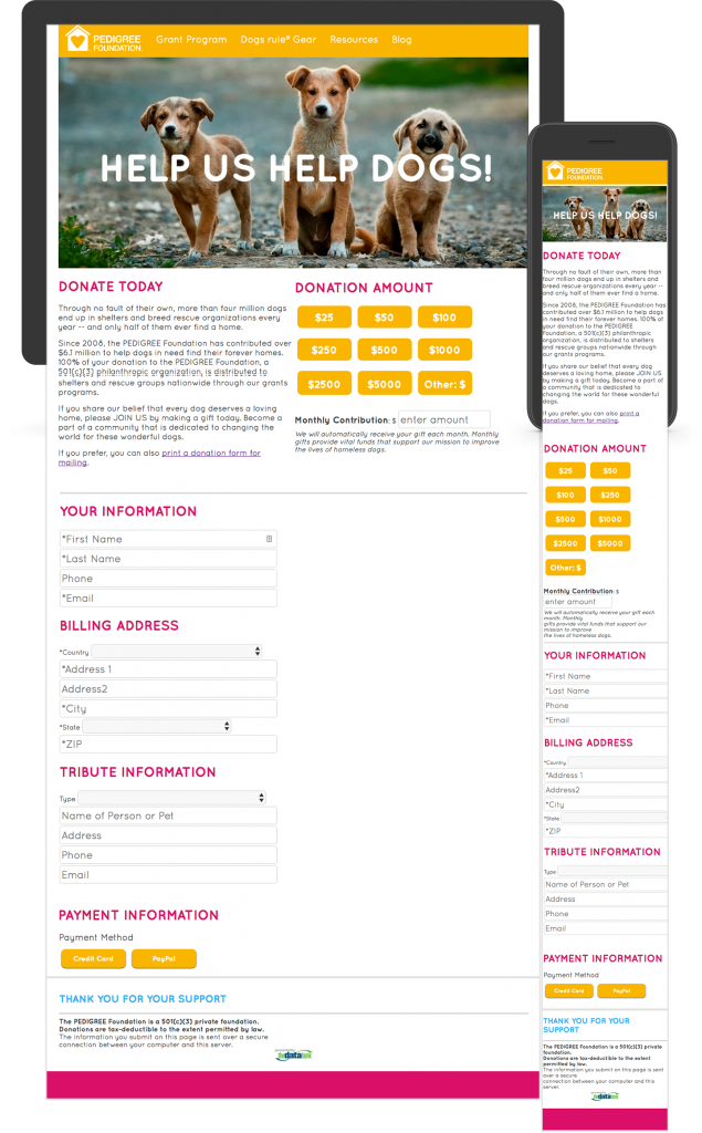
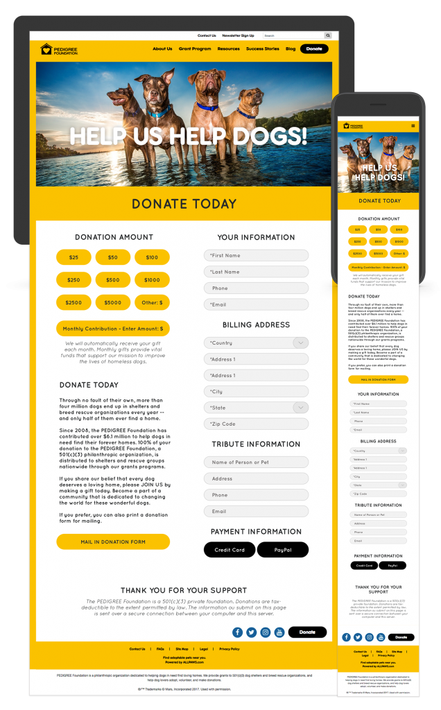
Nonprofit organization The PEDIGREE Foundation tasked us with upgrading one of their landing pages. The donation page needed an improved user experience for mobile, but the client didn’t want to lose any content. I took their existing content and sprinkled a little design magic on it while rearranging some elements, and voila, the page was done!
What was your inspiration?
The inspiration came directly from The PEDIGREE Foundation’s website. The PEDIGREE Foundation went through a website redesign recently. Since their donation page was developed by a third party, this page wasn’t redesigned and still had the old website look and feel.
What was the concept?
In addition to a much-needed facelift to the page, the client also specifically requested that this redesign work better on mobile devices while still displaying all the information needed. The client wanted the donation buttons at the top and one of the first things you see when viewing this page on mobile.
How did you create / execute?
The execution of this page was pretty simple. After redesigning the button elements, adjusted spacing, and a few tweaks to the typography, I rearranged the elements so they would stack better for a responsive design. The new layout looks more appealing and the user experience has a much better flow.
What did you learn from this? Any obstacles?
There are plenty of programs that you can use to mockup a web page such as Adobe Photoshop or Adobe Illustrator. I’ve been hearing a lot about the program Sketch lately in the UX/UI community buzz around town and wanted to try the program for myself. Because this was a simple one page redesign I went ahead and downloaded the free trial and dived right in. I really like the simplicity of Sketch and the focus on UX/UI designs within the program. The $99 price tag is pretty awesome too.
What were the results?
Here’s a look at before and after!


Looking for help with your website?

