

Designing the Alpha Pak Brand
Graphic Design | Strategy
When tasked with creating the brand design for Alpha Pak from the ground up, we started with translating the adjectives and voice of the brand into a visual identity. In doing so, we had a lot of fun developing our in-house brand that is sure to catch the eyes of adventurers and their dogs.
Here’s our graphic designer, LB’s process on how she thought through each of the design elements.
The Project
The Client:
Alpha Pak
Project Recap: 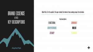
Alpha Pak, as one of our in-house brands, gave us the great opportunity to develop a brand design from the ground up. The only brand asset we had at first was the simple Alpha Pak logo. We needed to create Alpha Pak’s visual brand based off of the brand voice we wanted this brand to portray.
The adjectives we wanted this brand to convey are: Functional, Durable, Adventurous, Bold, Trendy, and Curious. So, how do we represent each of those adjectives visually? Well, we illustrate those adjectives through color, typography, photo and video style choices, and graphic elements. Obviously, there is a lot more that goes into developing the digital presence of a brand, but these are the visual identifiers that represent the very core of the brand.
Colors: 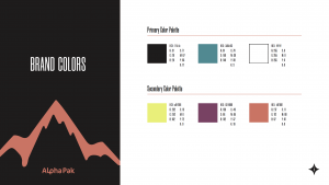
First off, we knew the brand colors needed to fit Alpha Pak’s personality. Since the Explorer Archetype is such a big part of the brand’s visual identity, we chose our main teal green color as a representation of the Explorer Archetype and the outdoors. Then, we chose a matte black as a softer alternative to a true black. And the stark white we went with really allows the colors to pop against one another. The three additional brand colors are inspired by the bright tones of the original Alpha Pak gear – lemon lime, plum, and coral. Each of the brand colors fits with one of the brand personality adjectives.
Type: 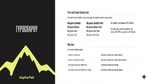
Next, we needed to pick a typeface that would fit the Alpha Pak brand. We needed one for print and desktop use, and one for web use. We chose the Morganite font family in semibold, medium, book, and light weights, all with their italic counterparts of course. The Morganite font family exudes a bold, confident, modern, and adventurous feel, so we knew it would be perfect for the Alpha Pak brand design. We then chose a complementary font for the Shopify website, the Archivo Narrow family.
Style Guide: 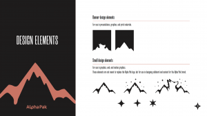
From there, we designed some additional illustrated elements, fun motion graphics, and print assets that fit the Alpha Pak brand. We put together a brand style guide with the Alpha Pak aesthetic, and we started digging into developing the website, product videos, and digital presence with the brand style guide as our leader.
Results:
Overall, we wanted to keep the Alpha Pak brand design bold, simple, and clean, with a lot of confidence. We feel that all of the visual brand elements do just that for the brand. The additional illustrated elements and motion graphics born also give the brand a fun, adventurous feel. The Alpha Pak site launched at the end of May, and we have thoroughly enjoyed getting the brand on its feet and running on to great things!

